With around 60% of all web traffic now coming from mobile, it’s crucial to create websites that deliver an outstanding experience across all devices. A mobile-friendly website isn’t just a nice-to-have, it’s essential, a slow, clunky or difficult to navigate experience can frustrate and turn off users.
So, what do we focus on to make a site truly mobile-friendly?
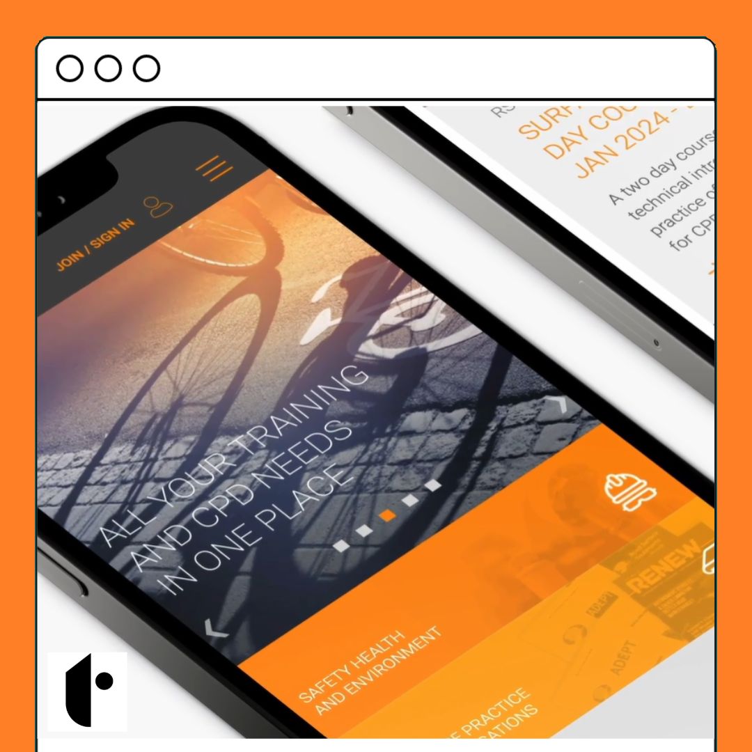
Responsive Design That Adapts, with flexibility in mind.
Prioritizing Speed & Performance. Speed is everything on mobile! Lightweight coding, compressed images, and leverage caching to ensure sites load in the blink of an eye – a slow site means lost opportunities.
Touch-Optimized Navigation. Mobile users navigate differently than desktop users. We design intuitive, touch-friendly menus and buttons that are easy to tap, without the frustration of zooming or mis-clicking.
Optimized Visuals & Content Layout. We don’t just shrink content to fit smaller screens; we rethink the layout. Images, text, and CTAs are optimized for readability and engagement. It’s all about balance and clarity.
Test, Test, Test. Finally, we test rigorously on a variety of mobile devices and browsers to ensure an engaging experience.
A mobile-friendly website isn’t just about adjusting to smaller screens, it’s about enhancing user experience and driving results. Whether you’re looking to boost conversions or improve SEO, a seamless mobile experience is the key.
We’d love to talk about making your website perform at its best on mobile, just get in touch!