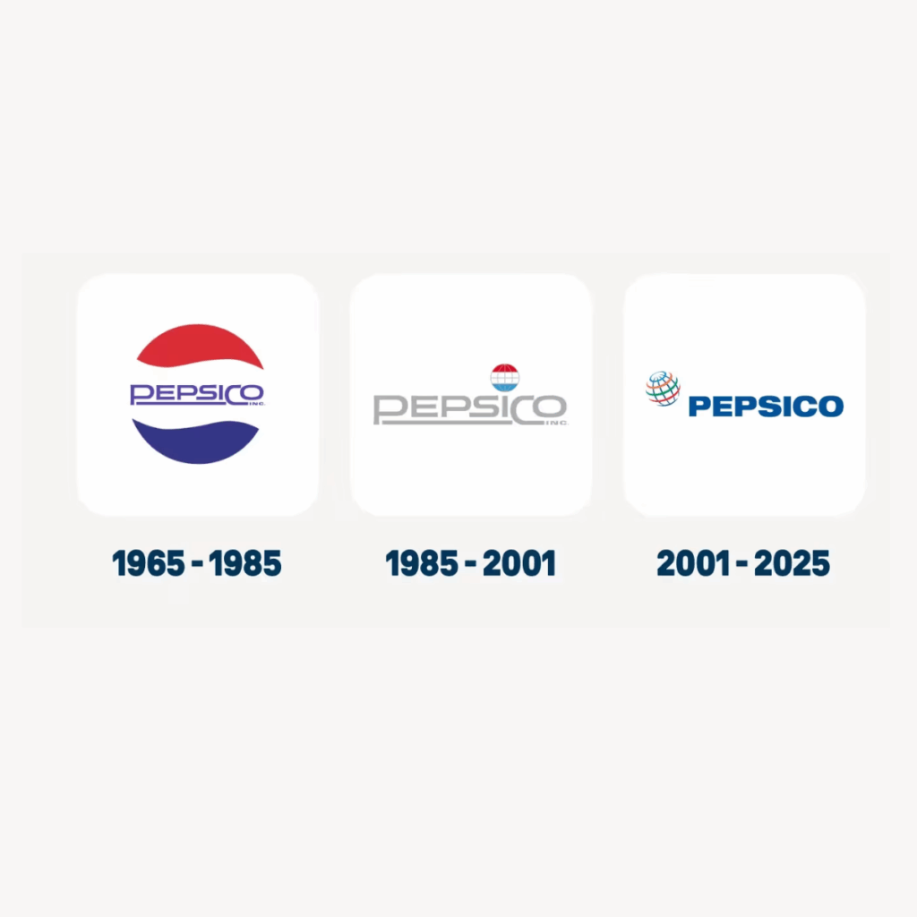
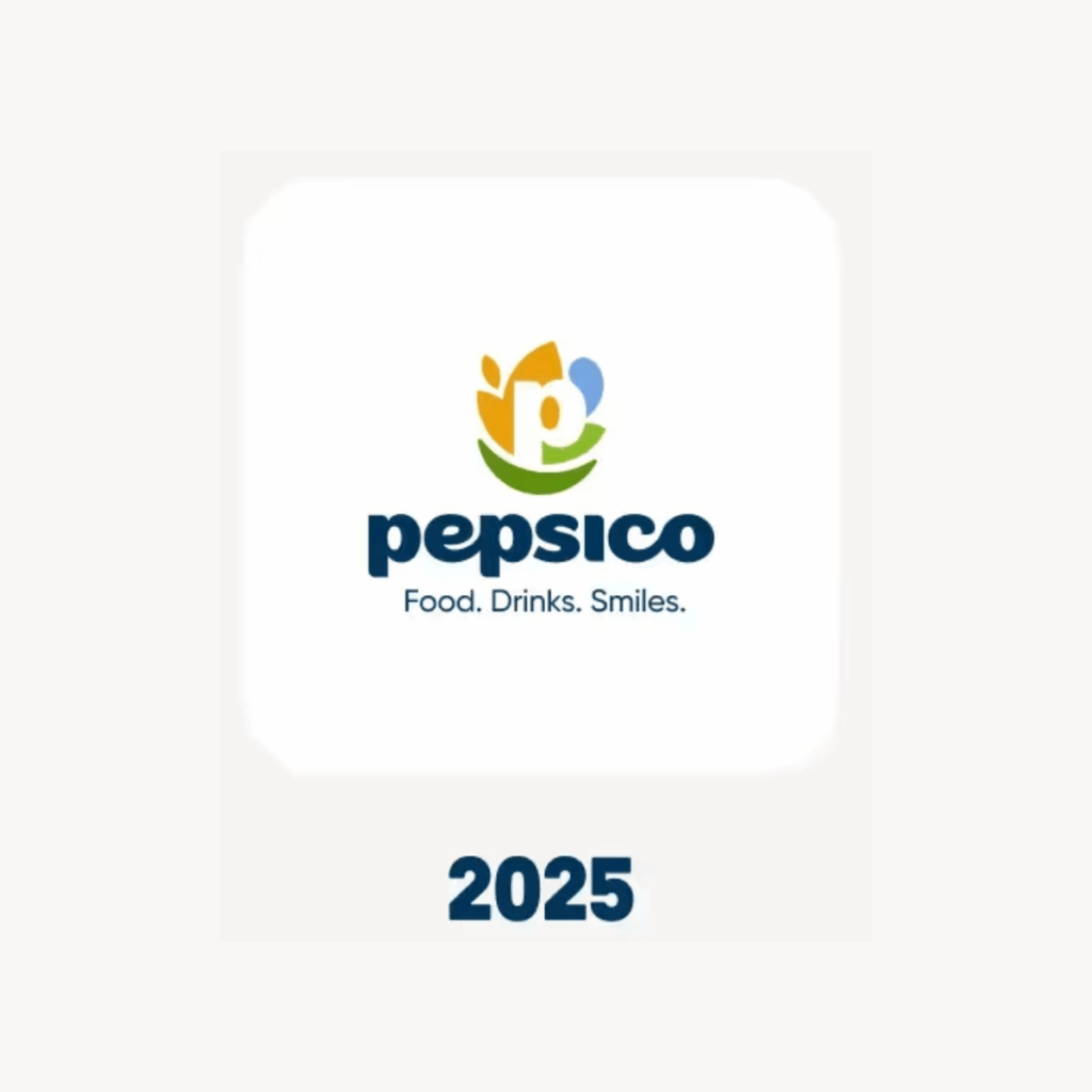
For the first time in nearly 25 years, PepsiCo’s refreshed its corporate identity. This isn’t just about cola anymore; it’s about the whole family of food and drink brands under the PepsiCo umbrella.
The move away from Pepsi’s red/blue globe to a more abstract “P + supporting shapes” ties to their wider business ambition. Their new look feels fresher, warmer and more human, built around the line “Food. Drinks. Smiles.” It’s a move to remind people they’re more than fizzy pop – they’re Quaker, Walkers, Tropicana, Doritos… and more.
At Thynne, we love seeing a brand with such strong heritage open itself up to something bigger. It’s a smart bit of repositioning – simple, confident, and properly people-focused.
Makes you think: if your business has grown or changed over the years, does your brand still tell the full story?
Let us know your thoughts, smart evolution or a bit too safe?