Even in 2026, we’re still spotting the same UX mistakes on websites. Often, it’s not because anyone doesn’t care – it’s just easy to miss when you’re too close to your own business.
Some of the most common issues we see include:
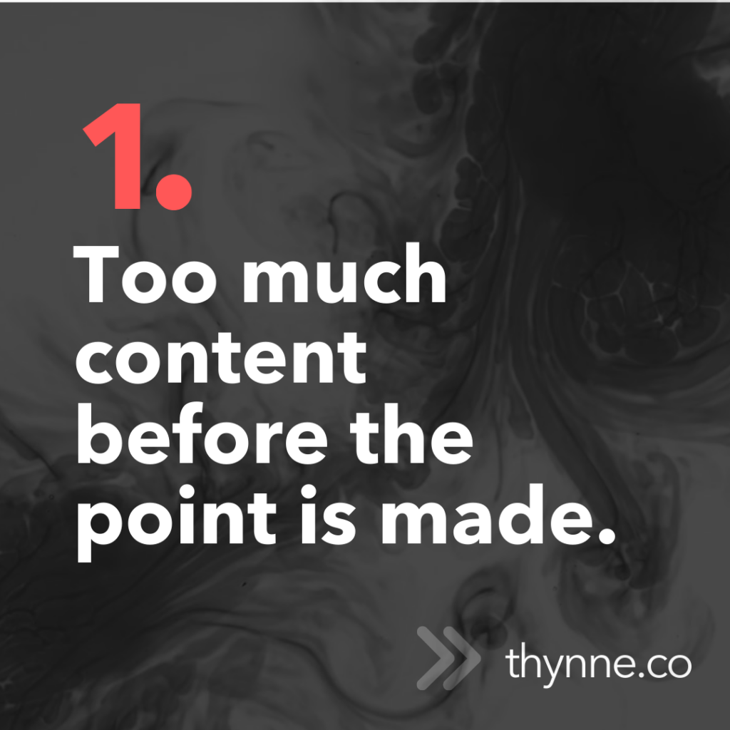
- Too much content before the point is made. Visitors want clarity fast.
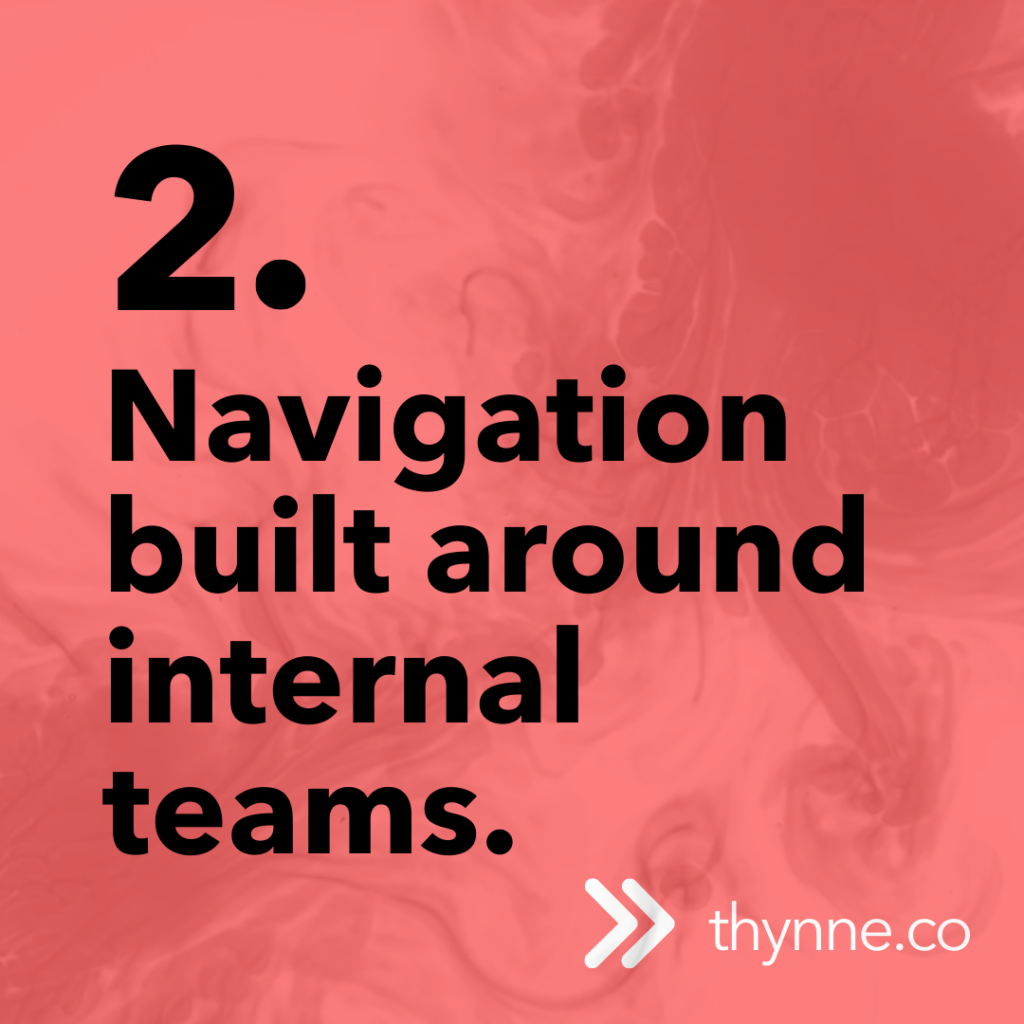
- Navigation built around internal teams, not users. Menus should make sense to the people using them.
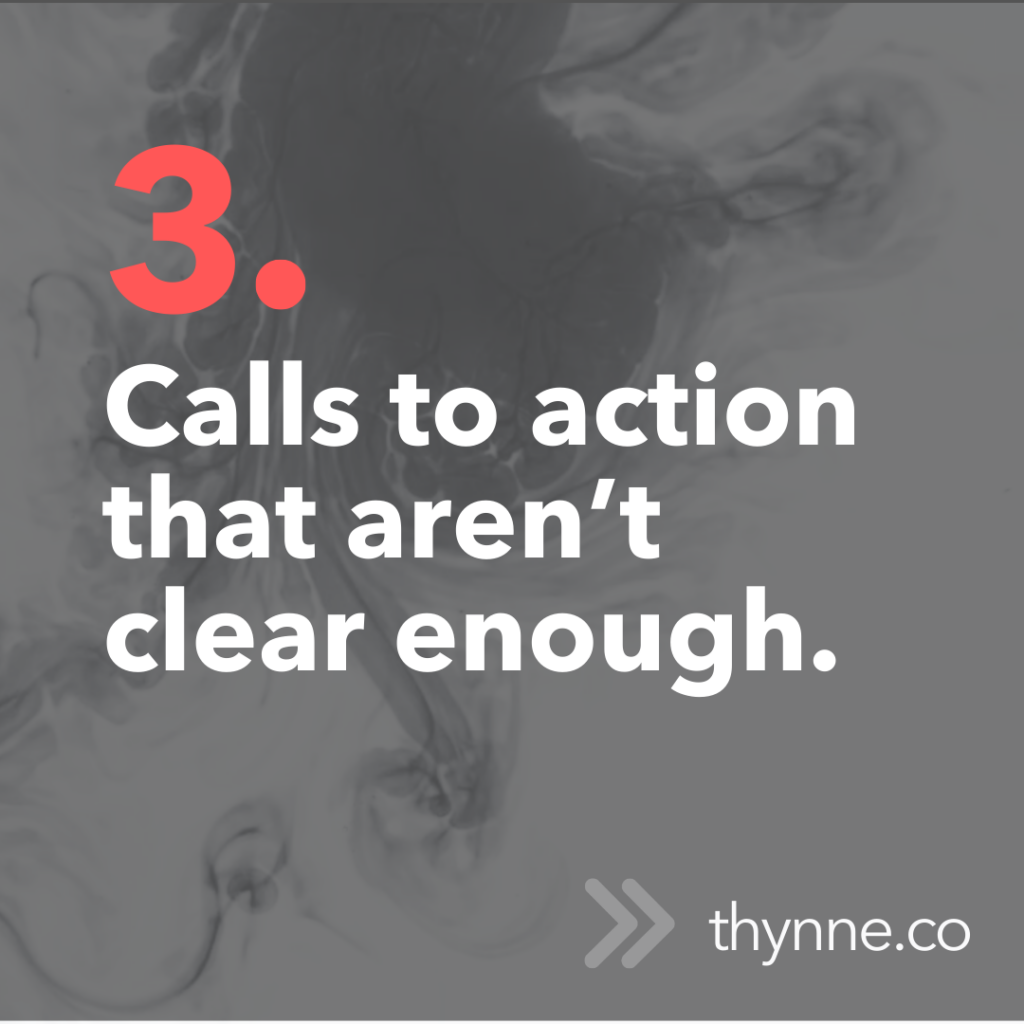
- Calls to action that aren’t clear enough. If someone doesn’t know what to do next, they won’t do anything.
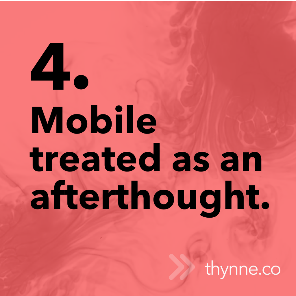
- Mobile treated as an afterthought. A poor mobile experience can cost you engagement and conversions.
The good news? The fixes are often simple. It starts by stepping back and viewing your site the way a visitor would: what do I need to know, what reassures me, and what do I do next?
At Thynne, we focus on this thinking before design even begins. That means fewer assumptions, more user testing, and asking plenty of honest questions early on.
Good UX isn’t about adding more features. It’s about making things easier, faster, and more intuitive for the people who matter most: your visitors. A little attention to these details can make a huge difference in how your website performs and how your audience feels about your brand.